In order to create a form in Velappity, the user must first log in. Once logged in, the user must select the “Forms” heading followed by the “Create” sub-heading in order for the page below to be displayed.
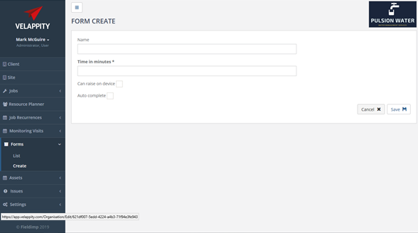
On the initial form creation page shown above, the name and time allotted can be entered. The name is essentially the name given to the form and it is the name that will appear in relation to the form and on mobile devices if the form is published. The time allotted is the time in minutes that the typical job, which uses this form, should take. This value can be changed when creating a job, however.
There are also two checkboxes which each respectively determine whether the form can be raised (i.e. created) on a mobile device and whether auto complete is enabled. There are also two checkboxes which each respectively determine whether the form can be raised (i.e. created) on a mobile device and whether auto complete is enabled.
Generally, users would assign jobs to a mobile user with a specific form type specified (e.g. fire risk assessment or property survey). These types of jobs can be planned and monitored by office staff via the Velappity web application. However, it may be more appropriate for some forms to be raised on device. One example of this would be a Health and Safety incident form. This type of form should be marked as “Can Raise On Device”.
Velappity jobs have various states and one of these states is a “Review” state which allows office staff to review and edit jobs before marking these as Complete. It is effectively a quality assurance phase before releasing the completed job. Some types of jobs may not require this stage and for these jobs “Auto Complete” should be selected.
When all the required details have been entered, the user can click the “Save” button to save these details and progress to the next form creation page. Alternatively, if the user does not wish to continue with the creation of the form, they can click the “Cancel” button.
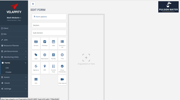
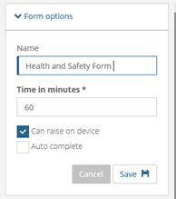
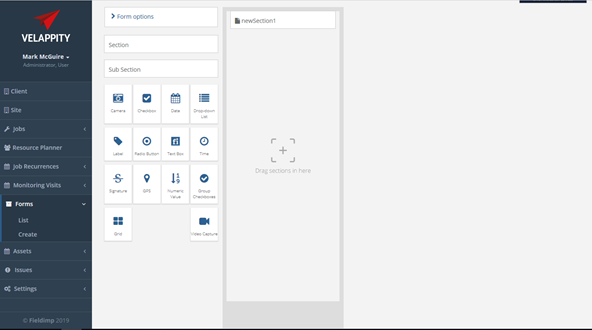
On completion of the first form creation page, the above “Edit Form” page will be displayed. This form allows the user to build their form from the ground up using Sections, Sub-Sections and Controls. There is also a “Form Options” heading which when clicked will allow the user to alter the details previously specified regarding the form. This can be seen below:
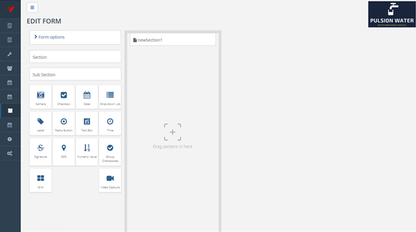
A Section can be added to the form by dragging the “Section” heading into the grey area marked “Drag sections in here”. This will then cause the new section to appear in this area. Forms in Velappity follow a hierarchical structure and sections encompass sub-sections and controls.
The name and details of the section can be changed by hovering over the new section and selecting the furthest right icon. This will allow the user to edit the section. Equally, the middle icon will allow the user to copy the section and the furthest left icon will allow the user to delete the section. When the furthest right icon is clicked, the following will be displayed:
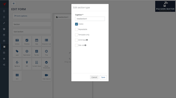
On the above pop-up, the user can change the caption of the section along with being able to decide whether the section is visible, repeatable template only and whether it is a Grid Input section. When the user is happy with the changes they have made, they should select the “Save” button to save the changes and return to the “Edit Form” page. Equally, the user could select the “Cancel” button which wouldn’t make the changes.
In order to create a Sub-Section, the section that the user wishes to create the sub-section within should be selected(clicked). It must also be noted at this point that the user can place a “Control” within a section or sub-section. The function of each control is shown below.
Controls
All controls have a caption which displays a prompt to the mobile user to describe what to enter. An example of a caption could be “Site Photograph” or “Manager Signature”. All controls can also be set to visible or invisible. Invisible controls will not be shown in forms but are usually used for cases where a control is shown when another control reaches a certain value. For example, if a checkbox asks, “Is the site clean?” and the answer is “No” then a textbox could be displayed to enter the reason the site is not clean.
The various controls available in forms are described below.
| Camera |  |
The Camera control allows photographs to be added into a form when the mobile user is performing a task (e.g. inspection). The mobile user can alter the caption of the photo to describe the photo. This control can also be marked as ‘required’ so that the mobile user must take a photo, or their job cannot be completed. |
| Checkbox |  |
The Checkbox control is used for data which can be On/Off, Yes/No, True/False or a similar binary choice. For example, “Is the site clean?” could have a Yes/No answer and a checkbox could be used for this type of question. Checkboxes can have “verbose” values assigned to the control for each state (on/off). Verbose values are explained below. |
| Date |  |
The Date control allows a date to be entered. |
| Dropdown List |  |
The Dropdown List control allows the user to create a list of optional answers for a question (e.g. Yes, No, Maybe, Don’t Know). Verbose values can be assigned to each optional answer. |
| Label |  |
The Label control allows the user to place a string of text on a form. This can be used for giving instructions to the mobile user (e.g. “Please remember to run tap for 2 minutes before measuring temperature”). |
| Radio Button |  |
The Radio Button is an On/Off type control which is similar to a Checkbox control but displayed differently. The default state of the control can be selected/not selected, and the verbose values can be assigned to each state. |
| Textbox |  |
The Textbox control is used for entering a string of text or notes. Default value for the text can be set as well as the number of rows displayed. Minimum and maximum length can also be specified as well as a regular expression which is used to ensure that the text entered is in the correct format (e.g. for a telephone number or postcode). |
| Time |  |
The Time control allows the selection of a time in hours and minutes from a dropdown menu. The default time can be set to the current time on the mobile device. |
| Signature |  |
The Signature control allows a signature to be written on the mobile device. |
| GPS Location |  |
The GPS Location control records the GPS coordinates on a mobile device to be recorded when the user selects the GPS Location control. This control can be used for logging the location of a user when they performed a task and provide proof of then user visiting the location. |
| Numeric |  |
The Numeric control is used to capture numeric data (e.g. temperature or pressure). The maximum and minimum value of the control can be set as well as a step value which defines the increments on which the control changes the number displayed. The user can also specify the number of decimal places to display. |
| Grid |  |
The Grid control allows data which is normally captured in rows to be captured so that a table of data can be produced in the output report. A section is associated with the grid with each field in the section corresponding to a column on the table. An example of using this control would be if you wanted to capture the name and temperature of many assets in a building. You would set up a section containing name and temperature fields then associated this section with a grid control. The name and temperature for many assets could then be captured in this grid with a separate section added for each asset. Section grids make it easier to present this type of data in tables in output Microsoft Word reports. |
| Group Checkbox |  |
The Group Checkboxes Control allows the user to create a group of checkboxes. This means the user can select On/Off, Yes/No or True/False or other binary values for a series of options. Once created, the user can make this control visible and/or required. As well as adding “options” i.e. individual checkboxes which make up the series of binary values. |
| Video |  |
ONLY AVAILABLE IN ENTERPRISE – CONTACT US |
Verbose Values In Controls
Verbose values are pieces of text that are shown in the output report when a control value is at a certain state. For example, an answer an “Is the site clean?” question could be Yes or No. When “Yes” we want text in the output report to read “The site was clean” and when “No” we want text in the output report to read “The site was not clean”. Verbose values would be used for this task.
Mandatory Fields
Controls can be set as “mandatory”. A job can only be completed when all the mandatory fields in its form have been entered by the user. The issue of field workers leaving a site without capturing all data is a common one and the mandatory setting on a control ensures that a job cannot be completed and sent back to the office until all mandatory controls have a value entered.
When the user has finished adding all Sections, Sub-Sections and Controls to the form, they can click on the List sub-heading under the Forms heading. A prompt will be displayed asking the user if they wish to publish their form.
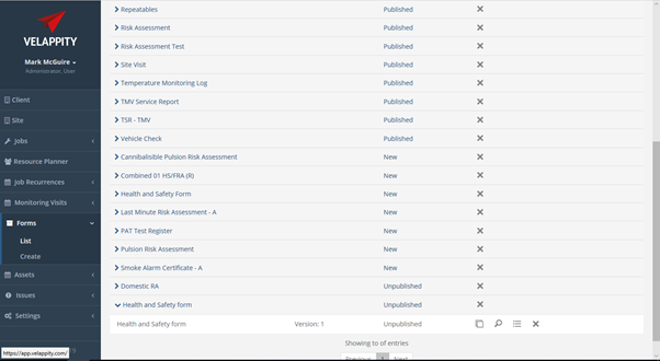
Forms have two states; unpublished and published. When designing a form, it is unpublished, and jobs cannot be created using this form. A form must be published before jobs can use this form. Forms also have versions so that old historic jobs created with previous forms can still be viewed. Note that for the form to be available for use on mobile devices, it must be published.
A new form is displayed on the Forms List page as shown below:
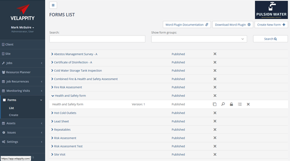
On the Forms List page, the user can search for a form using the textbox and drop-down menu above the list of forms. The name of the form should be entered into the textbox labelled “Search:”. The “Form State” dropdown displays the various states of forms that can be filtered in the list (e.g. All, With Published Version, Only New Versions, Only Unpublished Versions).
Editing a Form
The user can edit a form by clicking on the form in the form list and then clicking the Copy button:
The user will then be asked if they wish to create a “New Version” of the form, a “New Form”, or to “Cancel” this task:
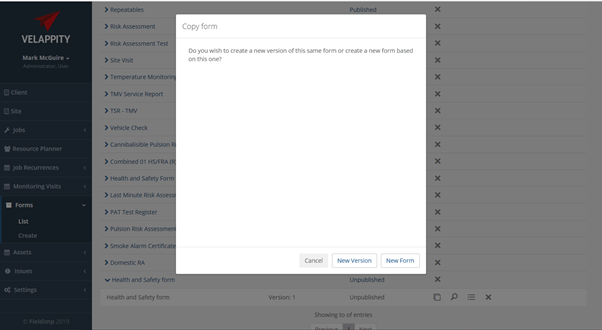
If the user wishes to make a new version of the same form, the user should click the “New Version” button, if the user wishes to make a new form all together, the user should click the “New Form” button. If the user wishes to cancel this, the user should press the “cancel” button. Once the “New Version” or the “New Form” button has been clicked by the user, the user will then be able to edit the form and they will be directed to the page shown below:
As can be seen above, the user will be able to edit sections and sub-sections when editing the form. When the user is finished editing the form, they can click the list sub-heading and they will see that the edited form is in the form list.
Deleting a Form
If there is a form in the Forms list which is no longer required and you would like to permanently remove it from your Velappity account, select the correct form and click the ‘Delete’ cross icon.